
Why Most E-commerce Funnels Leak Before Checkout
Most stores I look at do not have a checkout problem. They have a problem that shows up at checkout, which is a different thing, and the difference decides where you should spend your next two weeks.
On this page
When a store owner tells me conversion is low, the first thing they usually show me is the checkout. Sometimes the checkout deserves it. More often the checkout is where the damage becomes visible, because that is the only step with a clean number attached to it.
The people who reach checkout have already survived four or five decisions. Whatever went wrong earlier is invisible in the checkout report, and it is usually bigger.
The leak usually starts at discovery
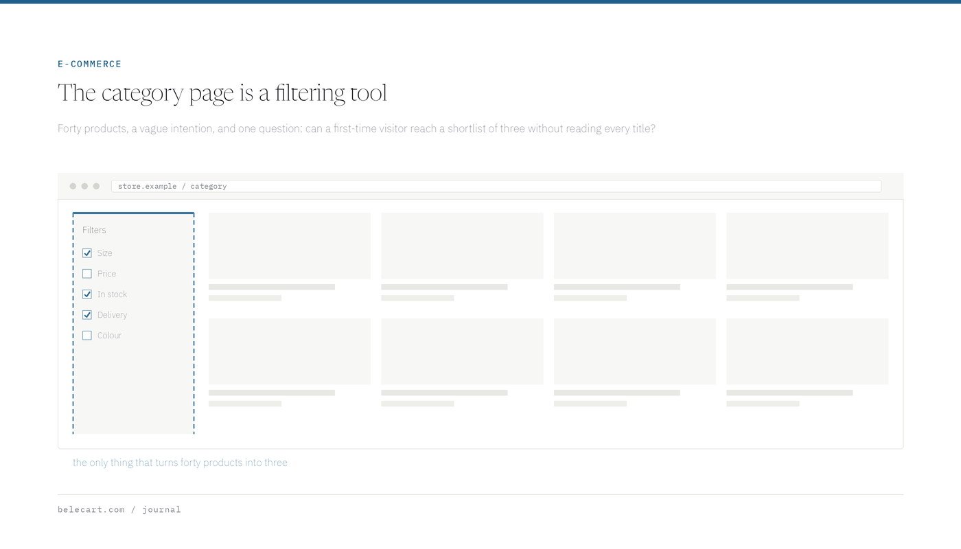
A visitor lands on a category page with forty products. She has a vague intention, not a shopping list. What she needs is a way to narrow forty down to three without reading forty product titles.
This is where a lot of stores quietly fail. Filters exist but sort by attributes nobody shops by. Sort options default to “featured”, which means an internal ordering that the customer cannot interpret. Product images are inconsistent, so scanning the grid takes real effort instead of being instant.
None of that produces an error. Nothing breaks. The visitor just leaves, and the analytics record a bounce on a category page, which almost nobody investigates.
My test for a category page is simple. Can I get from landing to a shortlist of two or three candidates in under fifteen seconds, without knowing the catalogue? If I cannot, neither can a first-time visitor, and the checkout will never see her.

Product pages that answer the wrong question
Product pages tend to be written by people who already know the product. That sounds obvious. It shows up in specific ways.
The page leads with brand language and lifestyle copy, then buries the three facts that actually decide the purchase: does it fit, when does it arrive, and what happens if it is wrong. Sizing lives behind a modal. Delivery time appears at checkout, after the customer has committed emotionally. Returns are a footer link.
I am not arguing that brand copy is useless. I am arguing about order. A visitor with a question and no answer does not email you. She opens a second tab.
Trust signals have the same problem. Badges cluster near the buy button because that is where conversion advice puts them, but the doubt they are meant to address usually arrives earlier, while the customer is deciding whether this store is real. A phone number in the header does more than a security seal near the cart.
Internal search deserves more attention than it gets
Visitors who use the search box on a store convert at a much higher rate than visitors who browse. They arrived with a specific intent and told you what it is, in their own words.
Then most stores hand them a search that matches on exact product titles and returns nothing for a typo, a plural, or a category word. The customer reads “no results found” and concludes the store does not stock the item. Often it does.
The search log is the cheapest research document a store has. It contains the vocabulary customers actually use, the products they expect you to carry, and every phrase your search failed to answer. I read it before I read any dashboard.
The cart is a decision point
Retail language treats the cart as storage. Behaviour says otherwise. For a lot of shoppers the cart is where they finally see the real total, and the real total is a new piece of information.
Shipping is the usual culprit. A customer who has spent eight minutes choosing a product meets a shipping cost for the first time in the cart, and the number reframes the whole decision. Nothing about that is irrational. She was comparing the product price and now she is comparing something else.
The fix is not necessarily free shipping. It is showing the number earlier, on the product page, so the decision is made once instead of twice. Stores that do this often see cart abandonment go up and revenue stay flat or rise, which confuses people until they realise the abandonment moved earlier and got cheaper.
Two other cart problems are worth naming. Carts that quietly empty between sessions punish exactly the customers who take time to decide. And carts that require an account before showing anything useful convert the visitor’s task from buying into registering.
What mobile changes
Mobile is not a smaller desktop. It removes hover, shrinks the visible area to roughly one decision at a time, and puts a keyboard over the bottom third of the screen whenever a field is focused.
Things that break on phones and pass on desktop: sticky headers that eat a quarter of the viewport, size selectors that need precise taps, image galleries that trap vertical scrolling, and forms where the input type is wrong so the keyboard shows letters when the field wants a number.
I test on a real phone, on cellular, not on a simulator with a fast connection. The simulator will not show you that the product image takes four seconds and the customer taps back before the price renders.
The handoff into checkout
There is a moment between the cart and the first checkout field where the customer changes context. On many platforms this is also a change of domain, template, or both.
Watch what happens there. The header changes. The support link disappears. The visual language shifts because the checkout is themed by the platform rather than the store. For a customer who was already unsure whether this shop is legitimate, that transition is the point where she checks the URL.
Keeping the logo, the contact route, and the basic colour treatment intact through checkout costs very little. It removes a question that most stores never realise the customer is asking.
Guest checkout belongs in the same conversation. Forcing account creation at this exact moment is the most expensive place to ask for a favour.
Where I would look first
If someone hands me a store and a week, this is the order I work in.
- Walk the whole path myself on a phone, on cellular, as a first-time buyer with no account. Write down every moment I hesitate. That list is usually more useful than the first analytics export.
- Check whether the funnel steps are even measured correctly. A missing add-to-cart event or a checkout that fires on page load will produce a story that is entirely fictional.
- Compare category-to-product rates across the main entry points. A single bad category page can drag the whole store average.
- Find where shipping cost first becomes visible, and how many steps sit between that moment and the product page.
- Look at cart-to-checkout separately from checkout completion. They fail for different reasons and mixing them hides both.
None of this requires a redesign, and that is deliberate. Redesigns are how stores avoid diagnosis. It is easier to approve a new template than to admit that the sizing chart is the reason returns are high and conversion is low.
The number at the bottom of the funnel is real. The explanation for it almost never lives there.